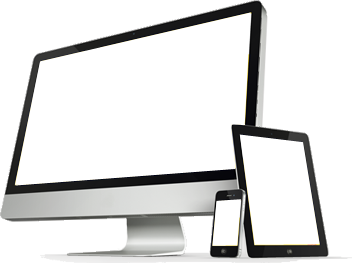
Currently over one-half of all searches are performed using a mobile device like a smart phone or a tablet. The question is, how does your website look on one of those? Is it squint inducing, are important features of your product or service absent, or is it just plain hard to look at? Access your site with your smartphone and see how it looks. If it does not look good, neither will your business.
Some of the challenges with making a site look good on mobile include:
- Graphical banners and videos can appear disjointed.
- Long forms are not user-friendly on mobile.
- Some widgets do not render properly.
- When the page transforms from a full screen mode into a small size of the cell phone screen, some non-vital elements can be hidden.
- Some content also gets transformed to a more compact presentation
Big Rig Media uses Responsive Web Design (RWD). This is a development approach to creating websites that provide the best viewing experience, including easy reading and navigation, across a wide range of devices (from mobile phones to desktop computer monitors).
Advantages of this development method include:
- It adapts to any browser on any device.
- The transformation from the “normal” look to mobile is transparent.
- It is less expensive to develop and upgrade.
Contact Big Rig Media for more information on how Responsive Web Design can improve your website for all devices.